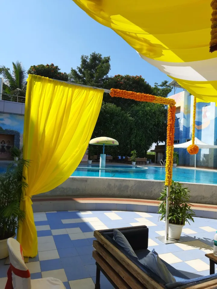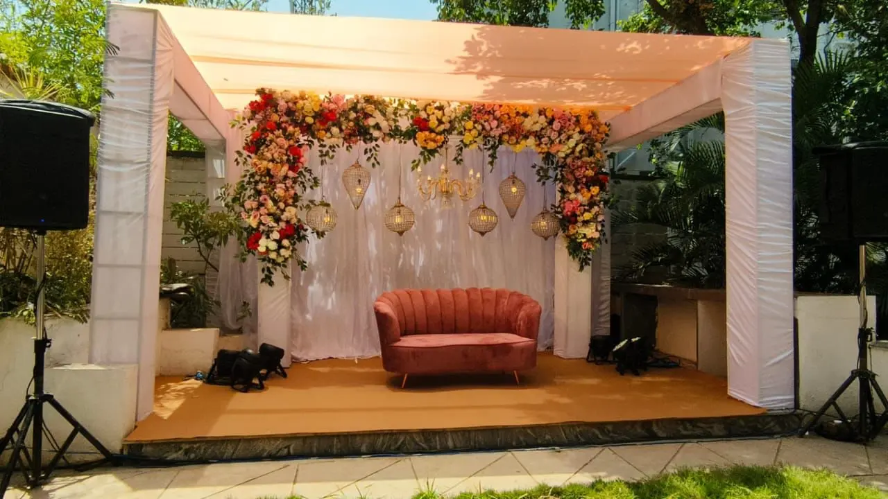

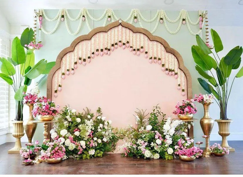
Pastel wedding decor relies on balancing soft color palettes with heavier textures, structured frames, and warm directional lighting so the muted shades do not fade into the background. Choosing the right flowers, layering matte fabrics, and avoiding pure white light keeps the setup rich, distinct, and photogenic across both daytime lawns and evening banquet halls.
Executing successful pastel wedding decor requires more than simply swapping out bright marigolds for pale pinks and mint greens. Soft shades are notoriously delicate, and under strong sunlight or glaring indoor lamps, they can easily wash out and look flat in photographs. When you plan a soft-toned celebration, you need deliberate choices in your color combinations, material weights, floral varieties, and lighting fixtures. Whether you are hosting an open-air afternoon ceremony on a Pune lawn or a night reception in an AC banquet hall, understanding how these elements interact will help you create a space that feels calm, elegant, and visually striking.
Planning this in Pune? See our wedding decoration themes: one team plans and runs it with you, since 2013.
Building a Balanced Color Palette
A successful soft-toned design starts with a deliberate color story rather than a random mix of light shades. Instead of picking five different muted colors, choose one dominant base like blush pink, ivory, or pale champagne, and pair it with two supporting accents such as dusty sage, soft peach, or muted lavender. This restraint gives the eye a place to rest and stops the venue from looking overly washed out. If you lean entirely into very pale tones without enough contrast, large spaces tend to feel hollow and uninspired.
Adding Depth Through Contrast
You can anchor soft hues by introducing subtle metallic touches, such as brushed gold stands, antique bronze frames, or muted copper candle holders. These metallic elements catch the ambient light and provide a necessary visual break from the continuous sea of pale fabric and blooms. When you are planning your seating arrangements, consider pairing pale tablecloths with slightly darker wooden chairs to keep the furniture from disappearing into the floor.
- Pick one dominant base shade and two secondary accents.
- Avoid using more than four distinct colors across the entire venue.
- Incorporate brushed metals or warm wood to ground pale tones.
- Keep the floor and large structural pillars neutral so the decor pops.
Choosing the Right Fabrics and Textures
Fabric choice dictates how light interacts with your soft-toned theme. Shiny materials like cheap satin or heavy polyester often reflect harsh glares and cheapen the aesthetic of delicate palettes. Matte and semi-matte textiles such as raw cotton, heavy georgette, linen blends, and soft tulle absorb light differently, giving your drapes and chair ties a rich, cloud-like depth. Layering different fabric weights adds dimension to stage backdrops and mandap pillars without requiring extra props or loud ornamentation.
Layering for Richness
Draping works best when you combine a sheer fabric with a slightly heavier backing to create natural folds and shadows. If you are decorating a seating lounge or a photo corner, mix woven textures like cane panels or macrame with smooth fabrics. This tactile variety ensures that even when people look closely at a pale cream or mint green backdrop, they see interesting surface patterns rather than a flat sheet of cloth.
| Fabric Type | Best Used For | Visual Effect |
|---|---|---|
| Raw Silk | Mandap pillars, backdrops | Subtle sheen, rich texture |
| Chiffon / Tulle | Ceiling drapes, pathway arches | Soft, airy, translucent flow |
| Linen Blends | Table runners, lounge seating | Matte finish, organic look |
Selecting Flowers That Hold Their Shape
Floral styling is the backbone of any soft-toned wedding setup, but delicate blooms require careful selection based on weather and timing. Traditional local choices like pale roses, baby’s breath, white tuberoses, carnations, and seasonal hydrangeas work wonderfully together. However, hydrangeas and certain soft pink roses tend to wilt quickly under direct afternoon heat if they are not properly hydrated with concealed water tubes in the floral foam.
Mixing Botanicals and Foliage
To make pale blossoms stand out, mix them with muted green foliage like eucalyptus leaves, silver cineraria, or dusty miller. The grayish-green leaves provide a natural frame that highlights the soft pinks, peaches, and lavenders instead of letting them blend into the background. For evening events, consider adding dried pampas grass or bleached ferns for an extra layer of structural interest.
- Use hidden water sources for delicate blooms on outdoor lawns.
- Incorporate silver-green foliage to frame pale flower clusters.
- Mix fresh flowers with textured dried elements for added volume.
- Avoid overusing dyed flowers that might stain neighboring fabrics.
Mastering Lighting for Day and Night
Lighting can completely change your color palette, making pastel shades look either stunningly ethereal or dull and grey. During daylight hours, position your main seating areas to make the most of soft, diffused natural light without putting guests directly into harsh glare. For evening celebrations, avoid stark white or bluish LED floodlights, which strip the warmth right out of peach, blush, and mint hues and make them look cold.
Creating Warmth After Sunset
Warm amber and neutral white spotlights help maintain the rich, inviting warmth of soft color schemes after dark. Use fairy lights behind sheer white or blush drapes to create a gentle glow that highlights the layers of fabric. Pillar candles in glass cylinders placed along pathways and table edges also add a soft, flickering illumination that flatters pale floral arrangements far better than harsh overhead lighting.
- Use warm amber lighting instead of cold white LEDs.
- Diffuse direct sunlight with strategic canopies or sheer overhead sails.
- Place low-level candles to add depth to table centerpieces.
- Test your lighting setup during evening rehearsals to check color tones.
Coordinating Furniture and Small Details
Every small detail contributes to the cohesive look of your celebration, right down to the chairs, signage, and table accessories. Instead of standard rental furniture that clashes with your soft aesthetic, opt for whitewashed wooden chairs, light cane seating, or upholstered couches in neutral beige. If you are planning an intimate gathering in a cozy venue like Kothrud, keeping furniture low-profile prevents the room from feeling crowded.
Bringing It All Together
Pay attention to stationary, welcome boards, and table numbers, ensuring they match your chosen color typography. Acrylic boards with matte pastel backing and fine metallic lettering look exceptionally clean. When you coordinate these minor elements with your larger floral installations and drapes, the entire event space feels thoughtfully designed from the moment guests walk through the entrance gate.
- Match welcome signage and stationery to your main color palette.
- Choose light wood or neutral upholstered furniture over dark plastics.
- Keep table centerpieces low so guests can converse across tables easily.
- Ensure pathways remain clear of bulky decorative props.
Let Us Help You Plan Your Celebration
Designing a soft-toned celebration takes careful planning, attention to detail, and a clear understanding of how materials and lighting work together in real venues. One team, one point of contact — we plan, set up, and run everything so you can enjoy your celebrations without stress. Whether you are hosting a daytime gathering or an evening reception, we are here to bring your vision to life. Take a look at our wedding decoration themes page to explore different styles, or reach out to discuss your specific requirements. Get in touch with us today for a detailed, itemised plan tailored to your venue and preferences.
Frequently asked questions
How do I stop pastel decor from looking washed out?
You stop soft decor from looking washed out by pairing pale colors with textured matte fabrics, structured metallic frames, and warm amber lighting. Avoid cold white LEDs and pure white backgrounds, adding subtle contrast through darker wooden furniture or silver-green foliage.
Which flowers work best for soft-toned wedding setups?
Pale roses, carnations, hydrangeas, baby's breath, and tuberoses work exceptionally well when styled with dusty miller or eucalyptus leaves. These blooms hold their shape and color nicely, provided they are kept hydrated during warm daytime events outdoors.
Is soft color styling suitable for evening receptions?
Soft color schemes look stunning at evening receptions if you use warm directional lighting, candle clusters, and fairy lights behind sheer drapes. Avoid harsh overhead white lights that drain the warmth out of blush, peach, and mint shades.
What fabrics should I choose for drapes and backdrops?
Matte and semi-matte textiles like raw cotton, heavy georgette, chiffon, and linen blends create rich shadows and natural folds. Avoid shiny satin or cheap polyester fabrics, which reflect harsh glares and cheapen the overall aesthetic.
How far in advance should I finalize my design theme?
It is best to finalize your design theme and color palette at least three to four months before your event date. This leaves enough time to source specific fabrics, coordinate floral availability, and match lighting fixtures to your chosen venue.

Vicky founded Plan With YOLO in Pune in 2013 and leads the planning on corporate events, weddings and stage production across Maharashtra.