UI UX Design Company in PuneAgree the screens before anyone codes

We map the flows, draw the screens and build a clickable prototype you can tap on your own phone. Everything gets settled while a change still costs hours instead of weeks.

  • User flows
  • Wireframes
  • Clickable prototypes
  • Design systems
  • Usability sessions
  • Developer handoff

Ui ux design company in puneThe cheapest place to change your mind

Every product decision gets dearer as it travels. Moving a step in a flow diagram takes minutes. Moving it in a wireframe takes an hour. Moving it once the database, the interfaces and half the screens are written can take a fortnight and somebody's good mood. This stage exists to push as many decisions as possible to the cheap end of that line.

So we begin with the job a person is trying to finish, not with colours. What have they come to do, what do they already know, and what interrupts them halfway. From that we draw the paths, then plain grey screens, then a prototype you can tap through and hand to a colleague who has never seen it. Type, colour and motion arrive only once the structure holds.

Reviews are scheduled rather than accidental. Each round has a named audience, one question and a closing date, because a prototype drifting through months of opinions damages a project more than a firm refusal in week two.

  • Paths drawn before a single screen is styled
  • A prototype you can tap, share and test
  • Each review round has one named decision-maker
  • Handover includes states, spacing and error screens
  • A practice built since 2013 across 100+ brands and companies
Ui ux design company in pune

What the design stage coversSix things we hand over

Every design engagement produces these six pieces, sized to how complicated your product really is.

  1. 01

    Users and tasks

    A written note of who uses this, what they came to finish, and what usually gets in their way.

  2. 02

    Flow and screen map

    Every path through the product drawn as one diagram, including dead ends, errors and the way back.

  3. 03

    Wireframes

    Unstyled grey screens that settle layout, order and what belongs on each page before any styling begins.

  4. 04

    Clickable prototype

    A tappable version on your own device, shareable by link to anybody you would like to test with.

  5. 05

    Visual design system

    Type scale, colour, spacing, buttons and states defined once so later screens match without a discussion.

  6. 06

    Developer handoff

    Sizes, states, empty and error screens, plus written behaviour notes so nothing is guessed during the build.

Products we design forWhere this stage earns its keep

01

Mobile app screens

Onboarding, home, search, detail and account paths for an Android or iOS product still being scoped.

02

Web dashboards

Admin panels where staff spend hours daily, so density, filters and keyboard use matter more than decoration.

03

Booking and enquiry flows

The few screens between interest and a confirmed slot, where service websites lose most of their visitors.

04

Checkout and payment steps

Cart, address, delivery choice and payment screens rebuilt to remove every field nobody actually reads.

05

Registration and check-in

Sign-up, ticket and entry-desk screens for conferences and expos, drawn against how a real queue behaves.

06

Internal company tools

Attendance, approval, stock and reporting screens for teams who never chose the software they use.

07

Redesigns of live products

An existing app or site remapped where support complaints and usage data already point at the trouble.

08

Reusable design systems

A component kit and rules for companies shipping new screens month after month.

How our event planning worksFrom first call to final bow.

  1. 01 Day 1

    The call

    Tell us the date, the guest count, the budget and the feeling you want in the room. We ask the questions most people forget.

    You getFirst ideas and a budget range

  2. 02 Week 1

    Concept & moodboard

    Theme, décor, stage layout and a minute-by-minute run of show, drawn up and revised until it feels like yours.

    You getMoodboard, layout and an itemised quote

  3. 03 Weeks 2–4

    Venue, vendors & permissions

    Venue shortlists, caterers, artists, anchors and the paperwork — police, music licences and venue approvals — handled by us.

    You getLocked vendors, one point of contact

  4. 04 Event eve

    Build & rehearsal

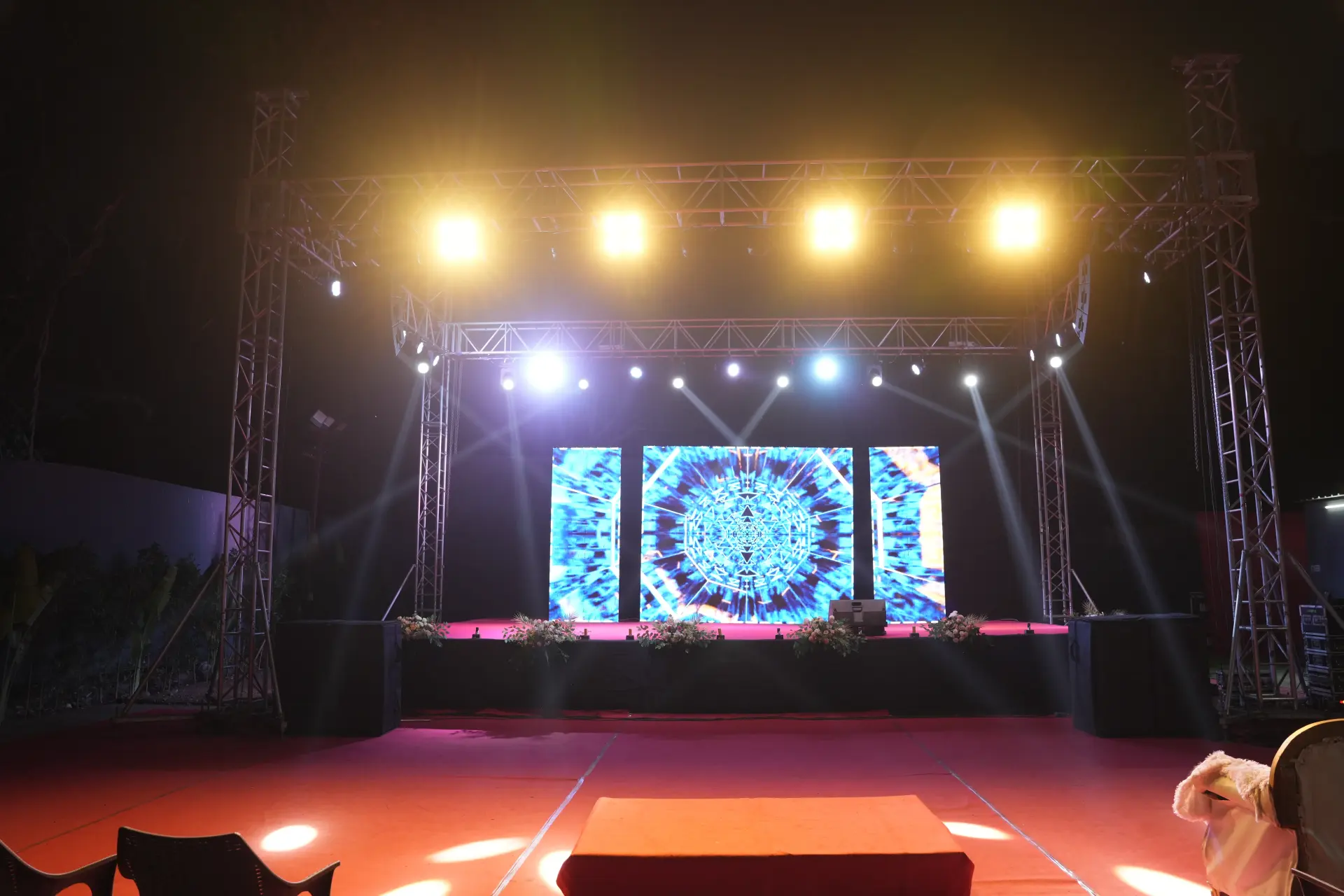
    Décor goes up, truss and LED walls are rigged, sound is checked and the anchor rehearses every cue with our show caller.

    You getA walk-through before guests arrive

  5. 05 Show day

    Showtime & wrap

    Our crew runs the floor, the stage and the guests. When it is over, we clear the venue and send you the photos.

    You getA calm host — you — and the memories

Most rebuilds are not caused by weak code. They are caused by a screen nobody argued about in time. Design is the phase where disagreement is cheap, and its entire purpose is to bring those arguments forward, while they still cost a meeting instead of a month of engineering.

Start with the task, not the screen

Before drawing anything, write down the job a person opens your product to finish. Book a slot. Check an order. Approve a leave request. Then note what they already know, what they will not know, and what interrupts them: an incoming call, a queue waiting behind them, a lift with no signal. Screens designed against one real task stay short. Screens designed against a feature list grow a menu, then a second menu.

Write that task list down and circulate it before the first drawing. It is the shortest document in the project and the one people keep coming back to, because it describes the product without a single screen in it. Anything requested later can be measured against it: does this help somebody finish the task, or is it here because a competitor happens to have it?

Why plain grey screens are worth the wait

Wireframes are deliberately dull so the conversation stays on structure. Show a coloured mockup too early and the feedback arrives about a shade of blue while the navigation is still wrong. With grey boxes, people talk about what should come first, which fields can disappear, and what the page shows when a list is empty. It feels slow for a week and saves a month afterwards. Apply the visual layer later, once the layout has stopped moving.

What each stage can and cannot settle

Every design artefact answers some questions and stays completely silent on others. Knowing which is which stops a team from over-trusting a good-looking prototype.

StageThe argument it can endThe argument it cannot end
Flow mapHow many steps stand between wanting and doingWhether anyone will understand a single step
WireframeWhat belongs on a screen, and what it ranks belowWhether the screen feels trustworthy
Clickable prototypeWhether a stranger can finish the task unaidedHow it behaves on a weak mobile network
Visual designTone, brand fit and how crowded a screen readsWhether the content on it is correct
Copy passWhat every label, error and empty state should sayWhether the rule behind the message makes sense
Usability sessionWhere real people hesitate, guess or give upWhether enough people want this at all

Review rounds that end in a decision

Fix the number of review rounds, and who sits in each one, before work starts. A round that helps has these four parts:

  • One question. "Is this path correct?" is a different meeting from "Does this look like us?"
  • One decision-maker in the room who can say no on the spot.
  • A closing date after which silence is treated as approval.
  • A written note of what changed and what was refused.

Circulating a link to a dozen colleagues and asking for thoughts is not a review; it is a method for collecting contradictions. Building and shipping the product itself is handled by our mobile app development service, which takes in scoping, the build, store submission and support after launch; this page stops at the prototype everyone has signed off.

Testing with people who are not you

A handful of people who resemble your real users will teach you more than a room full of colleagues. Hand over the prototype without explaining it, give one task, then stay quiet and watch where the finger hovers. In Pune this is easy to arrange: a service business in Kharadi can sit with a few of its own customers over one lunch hour. Write down the hesitation, not the compliments. People are polite about design and honest with their hands.

Decide one more thing early: what this eventually becomes. The same paths can ship as an installed app or as a mobile web page, and the answer changes what we draw. Our website team can tell you whether a browser version does the job. Either way, keep the prototype. It becomes the reference the build is checked against, and later the quickest way to brief a developer who joins halfway.
Ui ux design company in pune — FAQsQuestions people ask us.

Can't find yours? Call or WhatsApp — a planner answers.

How much does UI UX design cost in Pune?

UI and UX design cost is driven by how many distinct screens and paths a product has, not by how decorative it looks. Something with one main task and a short sign-up is a far smaller job than a marketplace with buyer, seller and admin sides. Review rounds, usability sessions and whether a reusable system is required also move the effort. Share your task list for a scope.

What is the difference between UI and UX design?

UX decides how something works; UI decides how it looks and feels while working. UX covers the paths, the order of steps, what each screen must contain and what happens when things go wrong. UI covers type, colour, spacing, icons and motion. Products need both, and doing the surface first is the usual reason a redesign becomes necessary soon after launch.

Do we get a prototype we can try ourselves?

Yes, you get a link that opens on your own phone and can be shared with anyone. It behaves like the finished product along the main paths: taps move between screens, forms accept typing, and a task can be completed from start to finish. That is what makes it worth testing with customers and handing to developers instead of a long document.

How long does the design stage take?

The design stage usually runs a few weeks, and its pace is set by how quickly reviews come back. Mapping and wireframes move quickly once the task list is agreed. The delay is nearly always the gap between sending a round out and receiving one clear answer. If a launch date exists, tell us early and we will work the rounds backwards from it.

Can you redesign an app or website we already have?

Yes, and a live product is easier to improve because the evidence is already sitting there. Support complaints, drop-off points, usage data and your team's own workarounds show where people struggle. We map what exists, mark the friction, then redraw only the paths that deserve it rather than starting from zero. Partial redesigns are also simpler to release in stages.

Will developers be able to build exactly what you design?

Yes, as long as the handover contains more than pictures. We provide spacing and size values, component states, empty and error screens, and written notes on behaviour, such as what a long list does. Where a developer is already engaged, we invite them into the wireframe review, since one early comment about feasibility saves an entire redraw later.

Do you test designs with real users?

Yes, wherever the project allows for it. A short session with people who resemble your genuine users uncovers problems no internal meeting ever will. We set one task, stay silent and watch what gets tapped. Even a few sessions can change a path noticeably. When users are hard to reach, we test with staff who have never seen the screens.

Map it before you build it

Tell us the one task your product must make easy, and we will suggest which design stages you actually need.

Talk to our digital team