
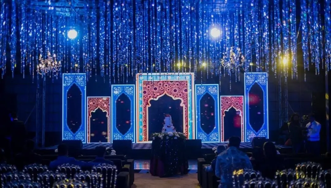
A 2026 event theme is built in layers, not decorated all at once: references first, then a palette, then one main material, then scale and sight lines, then lighting, and only after that flowers, print and table detail. Each layer depends on the one beneath it.
Ask ten people to describe a 2026 event theme and you will get ten adjectives. Ask the person actually building it and you get something else: a stack of layers, each one holding up the next. Understanding that stack explains why some rooms look designed and others look merely decorated, and why a theme that thrilled everyone on screen can feel thin the moment a hundred people walk in. This is the stack, from the bottom up.
Planning this in Pune? See our decorators in Pune: one team plans and runs it with you, since 2013.
What a 2026 event theme is once it leaves the mood board
It is a set of physical decisions about material, size, colour and light, delivered in a fixed build order.
Nothing romantic about it. The room gets rigged, then structured, then surfaced, then lit, then filled with soft and living things, then finished with the small items people photograph. Each layer sits on the one before, which is why changing a decision late is expensive: you are not editing a picture, you are pulling out something that other things are resting on.
It starts with references, not adjectives
A designer begins by gathering images and then deleting most of them, because the deleting is the design.
Fifteen pictures that share nothing produce a room that shares nothing. The useful exercise is to collect widely, then keep only the images that agree with each other about three things: what the space is made of, how bright it is, and how much empty space it allows. What survives that edit is your direction.
It also helps to write down the opposite. A short list of what this theme is definitely not is more useful to a supplier than another folder of inspiration, because it prevents the safe, familiar version of your idea from creeping back in during production.
How a palette becomes a material list
Colour is a decision about substances, because the same colour behaves differently in velvet, paper, paint and petals.
A deep green in matte fabric absorbs light and reads as almost black across a hall. The same green in a glossy panel throws the room back at you. In flowers it will not exist at all, because that shade is not grown, and a florist will substitute something greyer. So the palette conversation has to happen alongside the material conversation rather than before it.
The practical output is a short material list: the fabric and its finish, the rigid surfaces, the metal or wood in frames and furniture, the greenery, and the paper stock. Five lines, and the theme is already halfway defined.
Scale: where most themes quietly fail
Rooms are bigger than photographs, and a theme built at picture scale disappears in one.
Guests do not stand where the camera stands. They see the room from the door, from their seat and from the far end of a buffet queue, at distances of twenty, forty and sixty feet. At those distances small repeated items merge into texture and stop registering as anything at all.
The rule that fixes this is fewer and larger. One entrance element that fills the doorway beats fifty pieces scattered along a corridor. A backdrop is judged from the last row, so anything written on it has to be legible from there. Height is the cheapest kind of impact, because a room’s empty upper half costs nothing to occupy and is what people notice first on walking in.
One deliberate exception is worth making. A single area built at hand scale, with detail people can lean in and look at, gives photographs their close-ups and gives guests somewhere to gather. Keep it to one such area, place it where people already wait, and let the rest of the hall work at room scale.
Light is not a finishing touch
Half of what guests call the theme is actually the lighting, and it has to be designed with the material rather than added afterwards.
The venue’s own lights are the problem
Banquet halls come with warm downlights that stay on unless somebody dims them. Leave them up and every coloured wash you paid for turns pale. Part of the lighting plan is agreeing with the venue what gets switched off and who holds that dimmer during the programme.
Lighting a room is not lighting an object
A general wash makes the space feel a certain way. Focused light makes one thing matter. A theme needs both, and in a fixed proportion: if everything is lit equally, nothing is important, and photographs come back flat.
Colour temperature ties the room together
Mixing warm and cool sources in the same space without meaning to is the most common visible error at events. Candles, the stage wash, the screen and the venue’s downlights all have to agree, or the room looks accidentally assembled in every photograph.
The build order
Everything goes up in a sequence set by what has to hang from what.
| Layer | What it contributes | What happens if it is skimped |
|---|---|---|
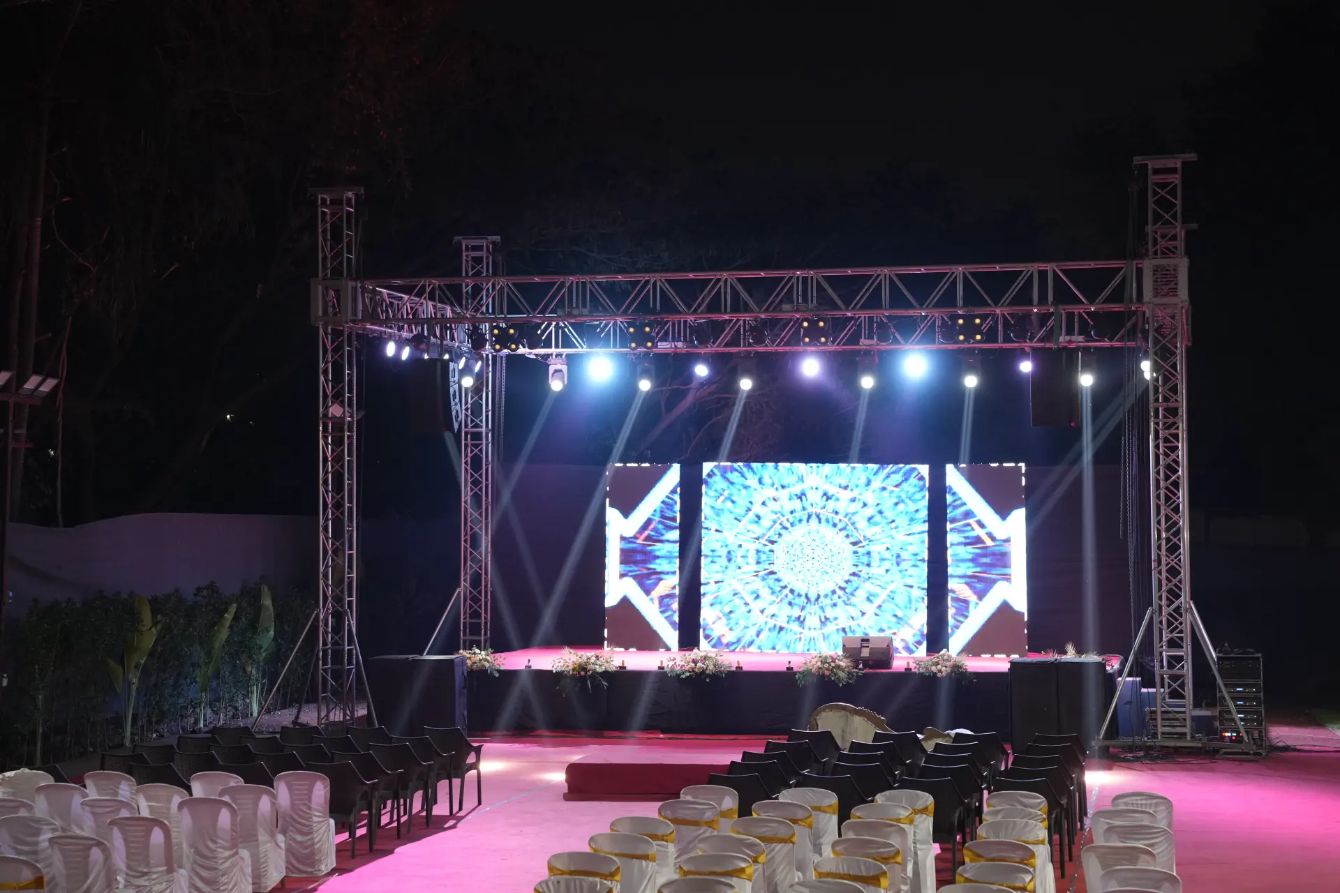
| Rigging and truss | Height, and something for lights and hanging pieces to attach to | The theme stays at floor level and the room feels short |
| Structure and backdrop | The shape the eye lands on first | A beautiful palette with nothing to sit on |
| Surfaces, drape and panels | The material story, and coverage of what you would rather not see | Venue carpet and wiring stay in every photograph |
| Lighting | Colour, focus and mood, plus half the photographs | Everything looks paler and smaller than planned |
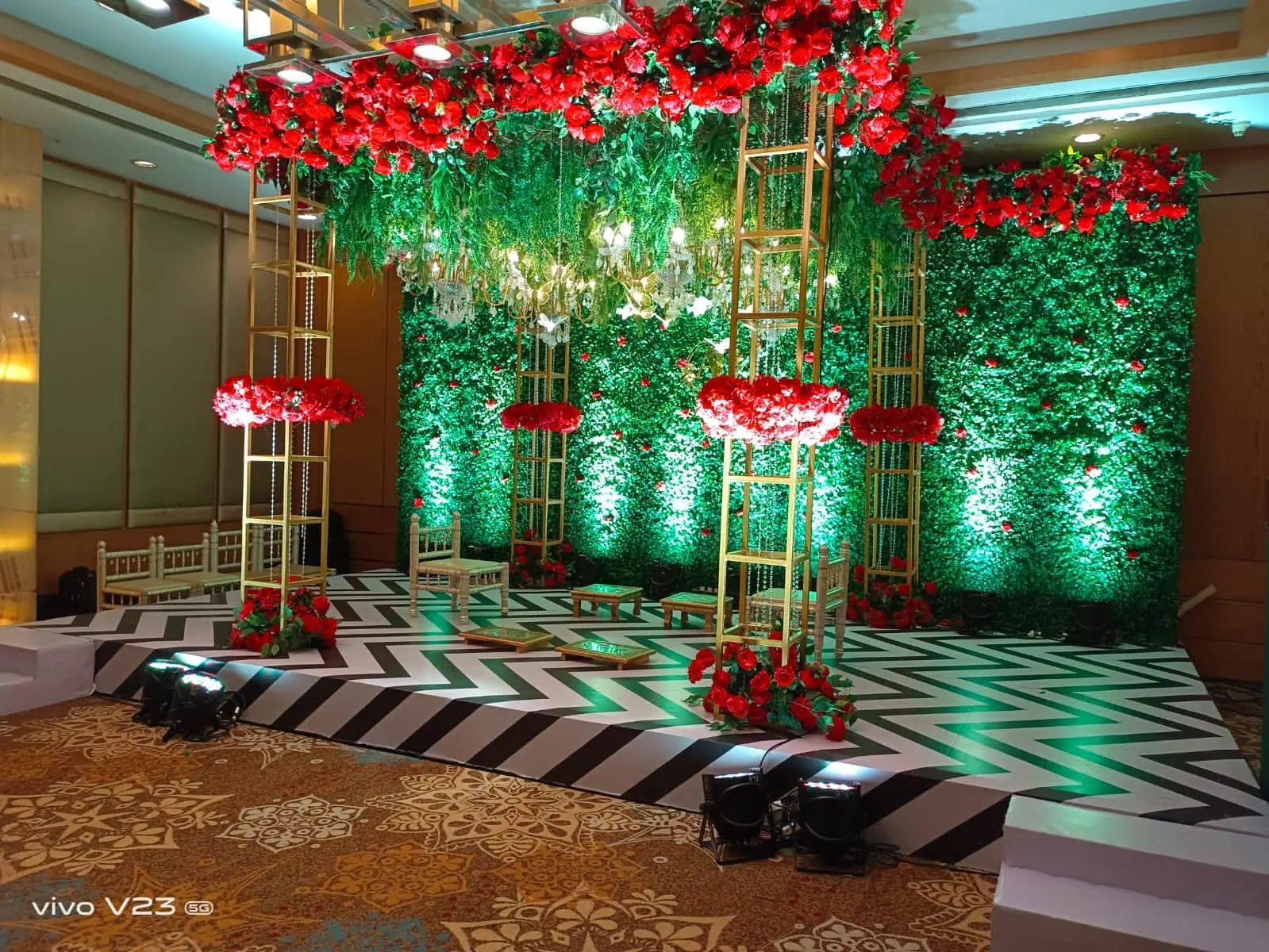
| Greens and flowers | Softness, scent and life against hard surfaces | The room reads as a set rather than a place |
| Print and signage | Names, direction and the motif repeating quietly | Guests feel lost and the theme loses its through-line |
| Table and hand-level detail | What people look at closely and photograph | Nothing survives the close-up shots |
| Screen content | The theme in motion behind the programme | A stock background undoing everything built around it |
Making the theme survive the event
A theme has to work while three hundred people use the room, not only while it is empty and being photographed.
- Guests touch things. Anything at hand height gets picked up, leaned on and moved. Fix it down or expect it somewhere else by nine.
- Service cuts through decor. Staff need routes to tables. A centrepiece that blocks a plate will be relocated by a waiter who does not care about your palette.
- Sightlines matter when seated. Tall arrangements between guests stop conversation, and someone will move them mid-dinner.
- Heat and time. Under lights, fresh flowers tire and candles soften. Anything installed in the morning has to still look right at ten at night.
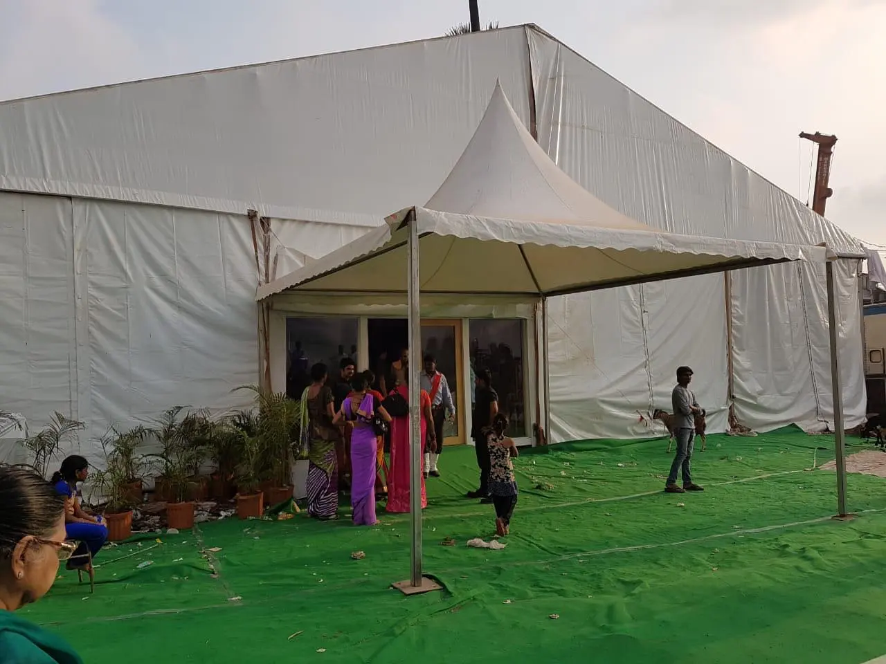
- Outdoors adds weather. Wind takes light panels and paper. In Pune, anything outdoors between June and September needs a covered version designed at the same time, not improvised on the day.
What it looks like when the stack holds
A theme is working when a guest can describe the room in one sentence afterwards without having been told what it was called.
That is the only honest test. If people remember a colour, a material and one image, the layers agreed with each other. If they remember individual objects, the theme was a collection of purchases. If they remember nothing, the scale was wrong.
Getting yours built
The stack above is what a design team is actually selling: the judgement about what goes in each layer and what gets left out.
Plan With YOLO has drawn and built event rooms since 2013, 500+ of them, for company functions, weddings, product launches and celebrations of every size. If you want directions to react to before committing, look through corporate event themes. What a full build includes, from rigging to the last table, sits on the event decorators in Pune page. Send your venue, date and rough guest number to us on the contact page and ask for a drawing with the cost split layer by layer.
Frequently asked questions
Why do event themes look better on a mood board than in the room?
Usually scale. A photograph flattens distance, so small repeated pieces look plentiful on screen and vanish when seen from forty feet away. Rooms also have empty upper halves that mood boards crop out. Fewer, larger elements with real height nearly always read better than many small ones spread evenly around a hall.
How much difference does lighting make to a theme?
Roughly half of it. Colour arrives in a room through light as much as through material, so a palette chosen without a lighting plan will look pale and accidental. The most common error is leaving the venue's own warm downlights at full brightness, which washes out every coloured wash you have paid for.
What should a theme design pack contain before the build starts?
Measured drawings of the main structures, a material list naming fabric and finish, the colour references, a lighting plan showing positions, and a build order with access timings. Without drawings you are approving an impression, and the first time anyone discovers the backdrop is too wide for the stage will be on the build night.
Can you keep a theme going outdoors in Pune?
Yes, with a covered version designed at the same time rather than arranged on the day. Wind removes light panels, paper and anything unweighted, and between June and September rain is a working assumption. Build the outdoor theme so that the same palette and material read indoors too, and the switch costs you nothing visually.
Which layer should get the money if the budget is tight?
Height and light, in that order. Rigging gives the room its scale and gives lights something to hang from, and lighting carries the colour and most of the photographs. Table-level detail is the easiest layer to reduce, because guests forgive a simple table in a room that feels considered.

Vicky founded Plan With YOLO in Pune in 2013 and leads the planning on corporate events, weddings and stage production across Maharashtra.